Consul observability
This topic provides an overview of the observability features available to HCP Consul users through HCP Consul Central. A dashboard visualizes Consul server and Envoy proxy metrics to provide operational insights when monitoring or debugging your network’s performance.
Introduction
Consul servers emit a variety of agent telemetry metrics that can provide observability into network operations. This telemetry data captures information about system operations such as transaction latency, Raft leadership and elections, server health, and resource usage. Monitoring these metrics enables you to troubleshoot Consul server issues. For example, the Consul documentation details strategies for using server metrics related to Raft performance when diagnosing issues in write-heavy workload at scale.
In a service mesh, Envoy proxies emit metrics for connections and requests to services as well as metrics for their own resource usage. Monitoring request and failure rates through Envoy proxy metrics enables additional insights into your network's operations at the service level.
HCP Consul Central supports automated server metric collection for clusters running Consul v1.16 or later that are managed by HashiCorp or linked to HCP. You can use these data widgets to gain insight into Consul’s operations in support of both monitoring and debugging efforts.
You can also deploy a Consul telemetry collector to forward Envoy proxy metrics to HCP Consul Central, which visualizes the data in dashboards according to cluster or service.
Workflow
The overall workflow to set up and use the HCP Consul Central observability dashboards consists of the following steps:
- Use HCP Consul to deploy or link clusters. You can get insights into HashiCorp-managed clusters deployed with HCP, self-managed clusters created with HCP, or existing self-managed clusters that are linked to HCP Consul Central. For more information and guidance, refer to create and manage clusters or link self-managed clusters overview.
- Deploy the telemetry collector. When using
consul-k8s, this collector is automatically deployed to HashiCorp-managed and self-managed clusters running Consul v1.16 or later, as well as any cluster with an existing link to HCP Consul Central that is upgraded to Consul v1.16 or later. You can also deploy the Consul telemetry collector manually when the process does not begin automatically. - Get visual insights with the observability dashboard. HCP provides visualizations of Consul server and Envoy proxy data in widgets that populate the dashboard. Use them to monitor important indicators of your service network’s health so that you prevent and recover from outages.
Observability dashboard
To access the observability dashboard, go to the Consul overview. Click the name of a cluster and then Observability. A separate observability dashboard is available for each Consul cluster linked to your HCP organization as long as the metrics collector is deployed.
The observability dashboard consists of two sections:
- Server metrics visualizes data about Raft communication and resource usage among the Consul servers.
- Envoy proxy metrics visualizes data about proxy operations, including the number of requests and the number of proxies servicing requests.
If your cluster is linked to HCP Consul but the Envoy proxy metrics are missing, you may need to manually deploy and configure the Consul telemetry collector.
Display interval
By default, all charts display observability metrics collected during the previous hour. You can select a different time interval for your charts using a dropdown menu on the observability dashboard. You can view observability metrics according to the following intervals:
- Past 1 hour
- Past 4 hours
- Past 1 day
- Past 7 days
- Past 30 days
If the charts do not populate for any portion of the selected interval, it indicates that the Consul telemetry collector did not receive data from the server during that time.
Server metrics
The observability dashboard provides the following information about Consul servers:
Leader status
The leader status widget provides observability into your self-managed cluster’s Raft quorum. The widget provides the following information:
- Leader status indicates whether or not an elected leader has been seen in the last 30 seconds.
- Elections indicates the number of leader elections over the selected time frame.
- Latest heartbeat tracks the amount of time that elapsed over the past day without the leader being contacted. It indicates the max heartbeat, or the longest duration between leader contacts in the past day, as well as the latest heartbeat, or the amount of time elapsed since the leader was last contacted. The 95th and 50th latency percentiles are listed in milliseconds.

This visualization is produced by gathering the following Consul metrics:
Leader transactions
The leader transactions widget provides observability into your self-managed cluster’s write load and write latency. This widget provides the following information:
- Write load displays information about the maximum, median, and minimum number of leader transactions over any 10 second period during the selected time frame.
- Write latency displays information about the maximum, median, and minimum amount of time required for a leader to commit an entry to the Raft during the selected time frame. The 95th, 90th, and 50th latency percentiles are listed in milliseconds.

This visualization is produced by gathering the following Consul metrics:
Host resource utilization
The host resource utilizations widget provides observability into the overall memory and CPU utilization, as well as the I/O wait time for the server agents in a cluster. This widget provides the following information:
- Memory utilization displays information about the maximum, median, and minimum rate of memory utilization over any 10 second period during the selected time frame. Memory utilization is measured as a percentage of the server’s total memory.
- CPU utilization displays information about the maximum, median, and minimum rate of CPU utilization over any 10 second period during the selected time frame. CPU utilization is measured as a percentage of the server’s total capacity.
- I/O wait time displays information about the maximum, median, and minimum rate of CPU utilization during an I/O wait state over any 10 second period during the selected time frame. I/O wait time is measured as a percentage of the server’s total CPU capacity.

This visualization is produced by gathering the following Consul metrics:
You can find more detailed information about your servers’ resource usage in the expanded host resource utilization widget, which is also located on the server metrics dashboard.
Expanded leader status
The expanded leader status widget provides observability into Raft leadership and elections over a selected interval. Heartbeat measures the amount of time elapsed, in milliseconds, since the leader contacted the follower nodes to check whether it is still the cluster’s leader or if an election should be held. The color of the line indicates which server was the leader and a change in colors indicates that an election was held at that time.
When you hover over the line, the widget displays a heartbeat and timestamp. Because of the graph’s resolution, the number displayed as the leader’s heartbeat is the maximum heartbeat detected during the previous 10 minute interval. Similarly, leadership changes indicate that the election occurred during the previous 10 minute period.

This visualization is produced by gathering the following Consul metrics:
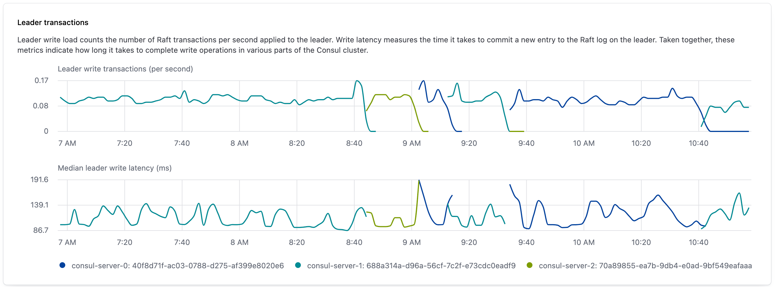
Expanded leader transactions
The expanded leader transactions widget provides observability into the number of Raft transactions the leader writes and the length of time it takes the leader to write them. The upper graph shows leader write transactions per second, which is the rate at which the leader writes entries to the Raft store. The lower graph shows the median write latency, which is the amount of time in milliseconds that it takes for the transaction to complete.
In both graphs, the color of the line indicates which server was the leader and a change in colors indicates that an election was held at that time.
This visualization is produced by gathering the following Consul metrics:
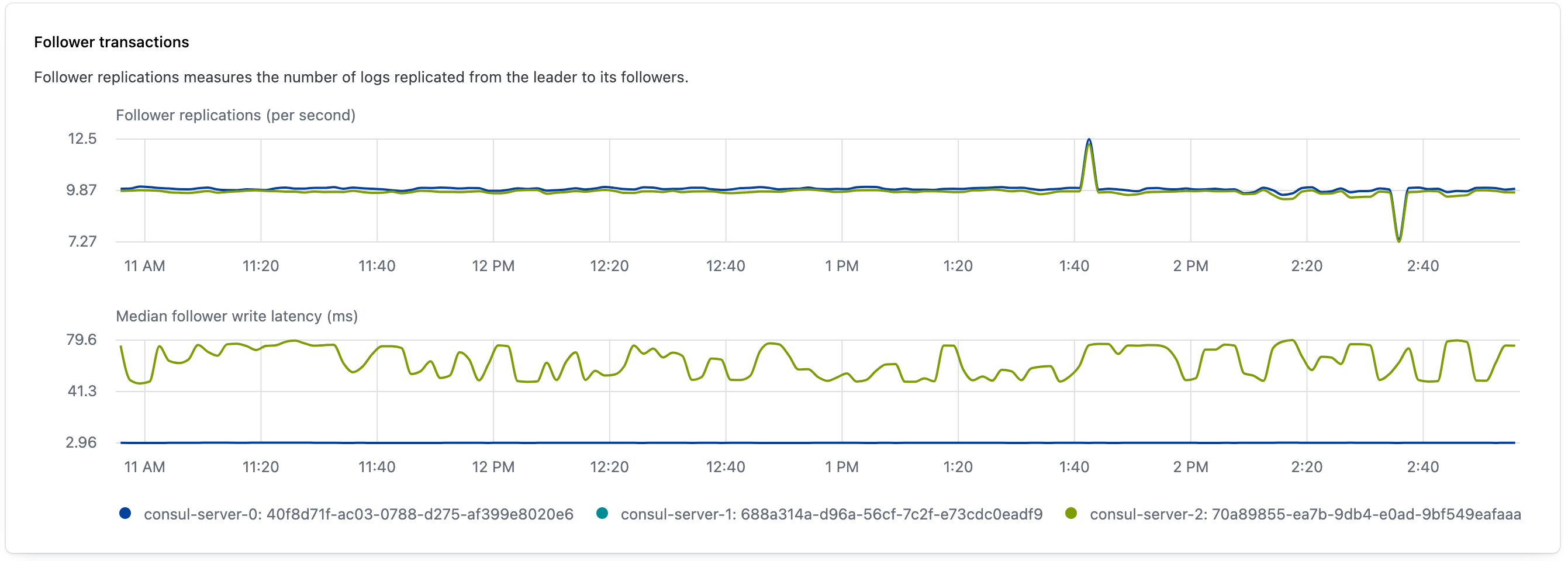
Follower transactions
The follower transactions widget provides observability into follower behavior in a Consul cluster over a selected interval. The top graph visualizes follower replications per second, or the rate that the leader replicated logs to followers. The lower graph visualizes the median write latency for each server, or the amount of time it takes for each follower to write a replicated log after receiving it.
This visualization is produced by gathering the following Consul metrics:
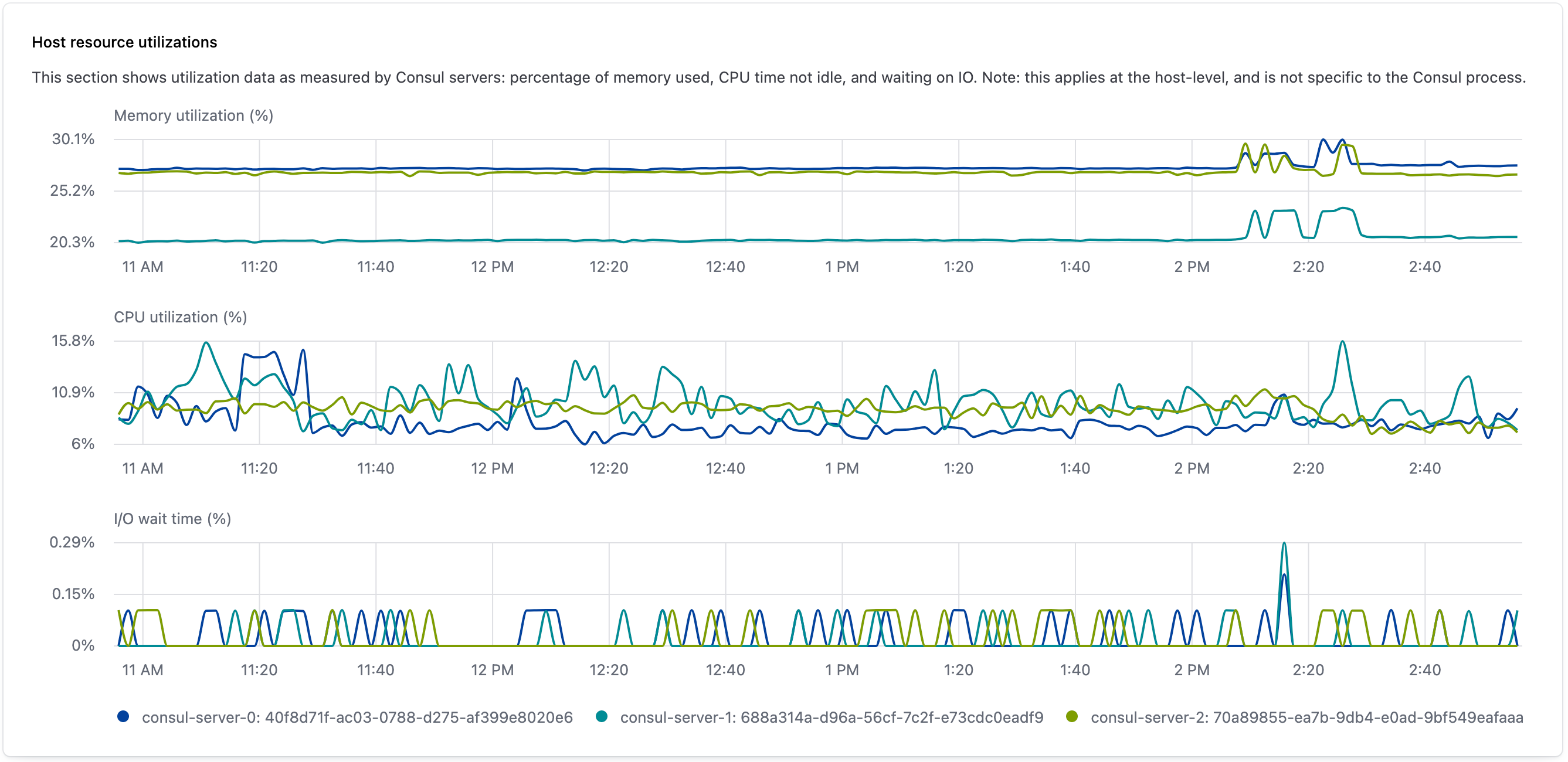
Expanded host resource utilization
The expanded server resource utilization widget provides additional observability into server resource utilizationby visualizing a server’s maximum, median, and minimum percentage of total resource usage as a series of bar graphs over a selected interval.
Each bar indicates a resource’s utilization rate over the previous 10 minute interval. The top of the bar is the highest measure rate, and the bottom of the bar is the lowest measured rate. The colored dots indicate each server’s median utilization rate for that resource during the interval.
This visualization is produced by gathering the following Consul metrics:
Consul server requests
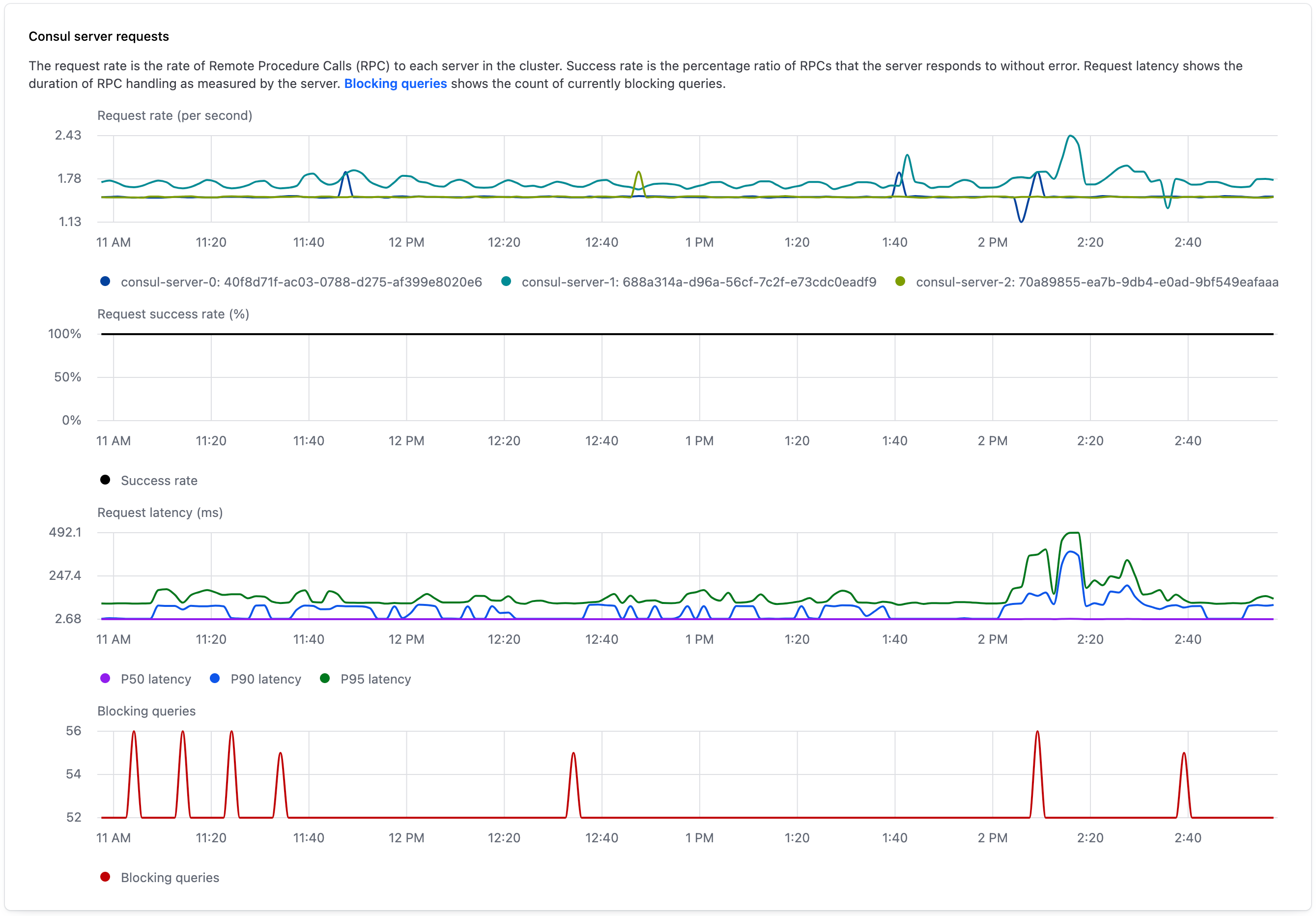
The Consul server requests widget provides observability into server request success and latency over a selected interval.
The top chart visualizes the request rate per second, or the rate of Remote Procedure Calls (RPCs) to each server in the cluster. In this graph, the lines have different colors to represent individual Consul servers.
The second chart presents the request success rate, which is the percentage of RPC requests that the entire cluster responds to successfully.
The third chart visualizes the r_equest latency, or the duration in milliseconds of RPC handling by the server. In this graph, the lines have different colors to represent the latency percentile for requests.
The bottom chart visualizes blocking queries, or the number of HTTP long polling requests that the Consul servers collectively have open. For more information about blocking queries in Consul and how to implement them, refer to blocking queries in the Consul API documentation.
This visualization is produced by gathering the following Consul metrics:
Connections
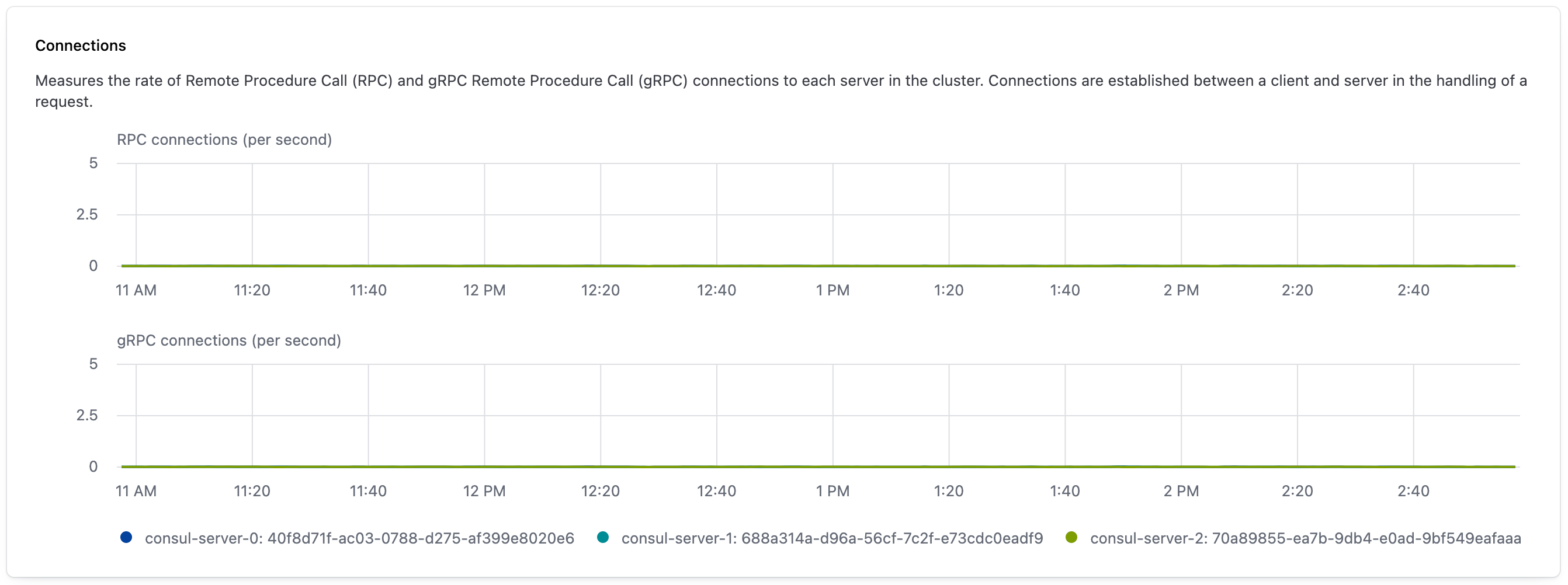
The connections widget provides observability into the rate of RPC and gRPC connections to each server in the cluster. Connections are established between a client and server when handling a request.
The top chart visualizes RPC connections per second. The lower chart visualizes gRPC connections per second. In both graphs, the lines have different colors to represent individual Consul servers.
This visualization is produced by gathering the following Consul metrics:
Registered peerings
The registered peerings widget provides observability into the number of active cluster peering connections a cluster has over time.
The chart visualizes the aggregate number of active cluster peering connections registered with the Consul. Changes to the line correspond to cluster peering connections that were created or lost. Cluster peering connections are lost when a HashiCorp-managed cluster is deleted, when a self-managed cluster is unlinked, or when the connection is removed using HCP Consul Central's cluster peering management feature.

This visualization is produced by gathering the following Consul metrics:
Envoy proxy metrics
The observability dashboard provides the following information about Envoy proxies:
Service mesh requests
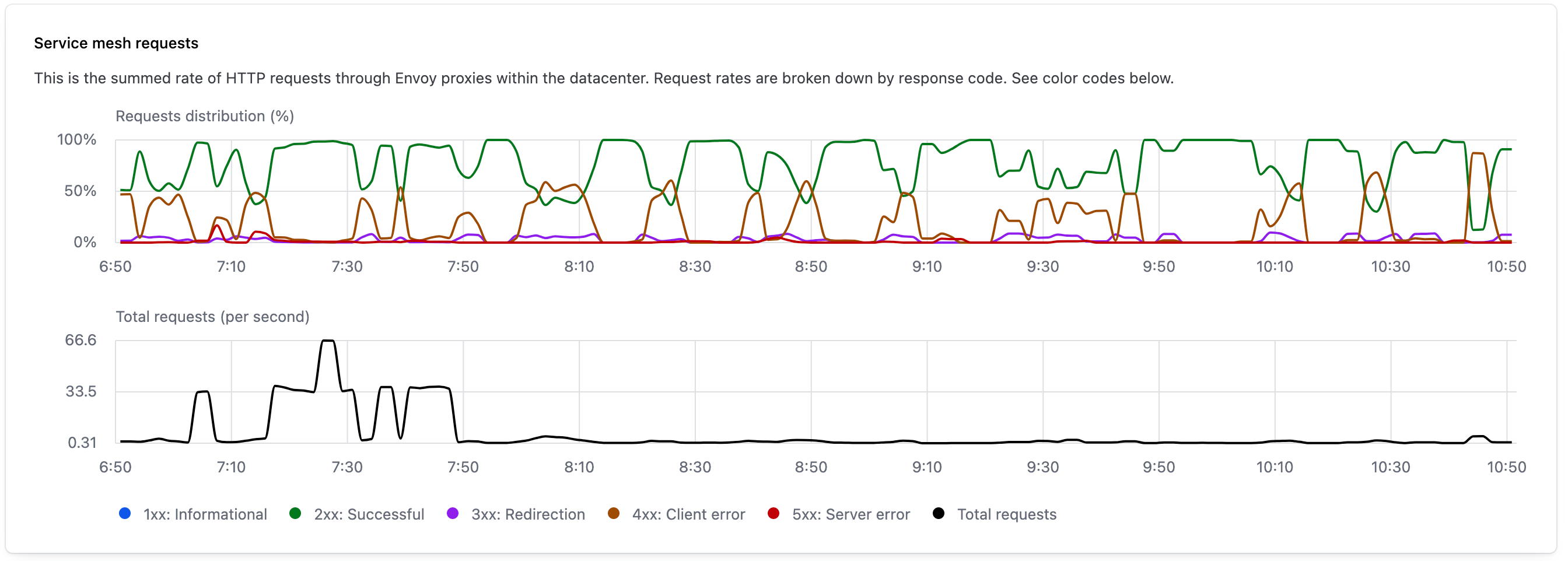
The service mesh requests widget uses Envoy proxy metrics to provide observability into the HTTP status codes returned by services in the service mesh.
The upper graph visualizes the distribution of HTTP requests according to the response codes they received, with the color of each line indicating the category of status code.
The lower graph visualizes the total number of requests per second that pass through Envoy proxies in the service mesh.
This visualization is produced by gathering metrics from Envoy. Refer to Statistics metrics in the Envoy documentation for more information.
Envoy connections
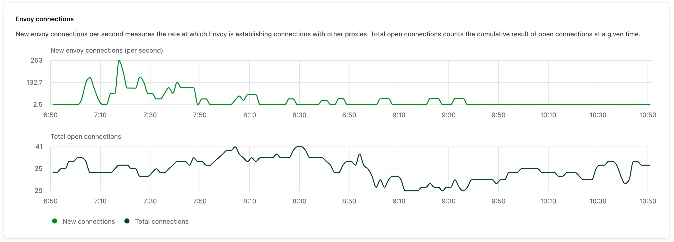
The Envoy connections widget provides observability into the number of new and open Envoy connections over a selected interval. The upper graph visualizes the number of new connections per second established by Envoy proxies. The lower graph visualizes the total number of open Envoy connections during the same period.
This visualization is produced by gathering metrics from Envoy. Refer to Statistics metrics in the Envoy documentation for more information.
Envoy servers state count
The Envoy servers state count widget provides observability into the overall health of your network’s Envoy proxies. The color of a line indicates an Envoy server’s state, and the line visualizes the number of Envoy servers that are in that state during a 10 minute interval. As described in the Envoy documentation, the possible Envoy states are:
| State | Description |
|---|---|
Live | The Envoy server is live and serving traffic. |
Draining | The Envoy server is draining listeners in response to a failed external health check. |
Pre-initializing | The Envoy server has not completed cluster manager initialization. |
Initializing | The Envoy server is running the cluster manager initialization callbacks. |
When you hover over a line, the widget displays exact counts for the number of Envoy servers in each state.

This visualization is produced by gathering metrics from Envoy. Refer to Server state in the Envoy documentation for more information.
Envoy proxies management status
The Envoy proxies management status widget provides observability into the number of Envoy proxies that are connecting and disconnecting from Consul over a selected interval. The graph visualizes the active connections between Envoy and Consul as a green bar that extends above the x-axis. The red bar that extends below the x-axis visualizes the number of Envoy proxies that lost their connection to Consul during the interval.
When you hover over a line, the widget displays exact counts for the number of Envoy servers that were connected and disconnected.

This visualization is produced by gathering metrics from Envoy. Refer to Management server in the Envoy documentation for more information.